


Branding, Photography Direction, Print Design
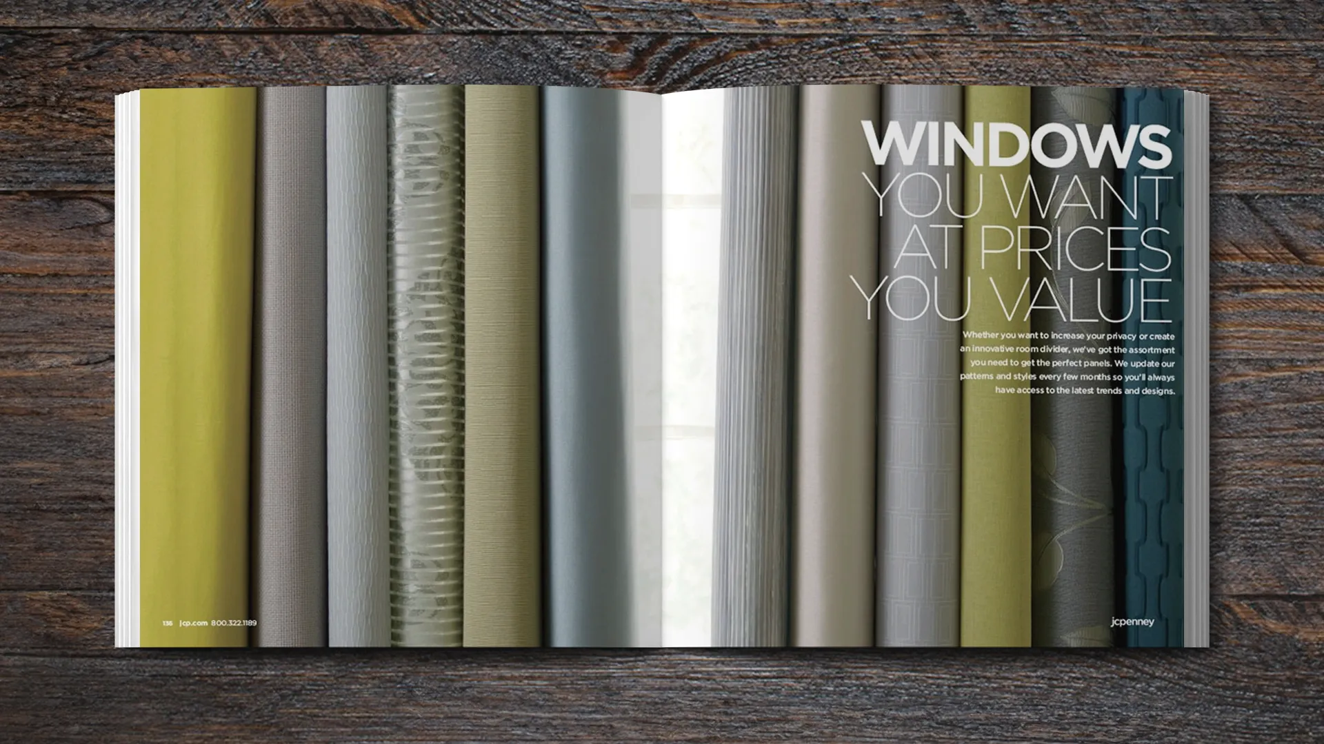
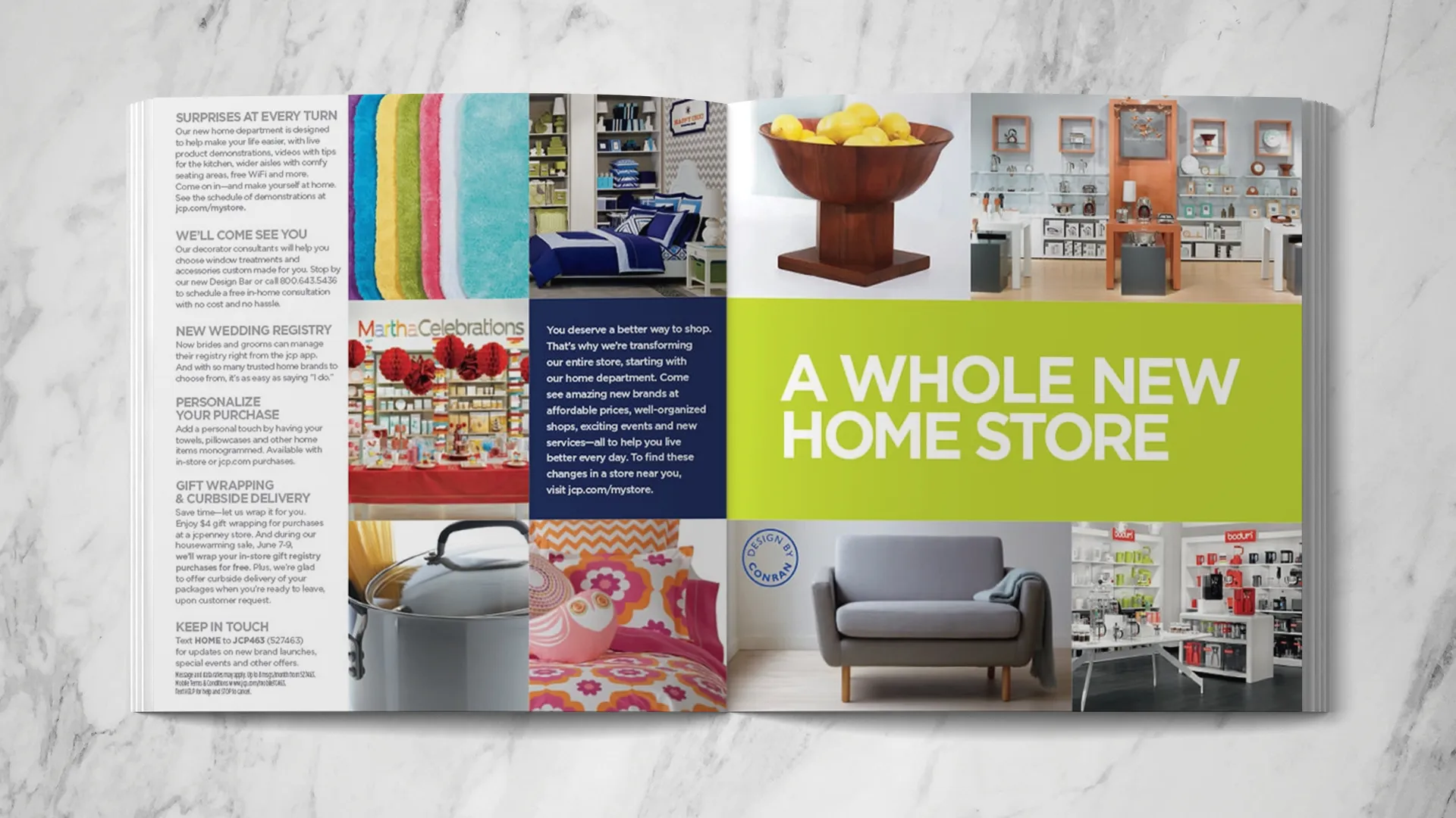
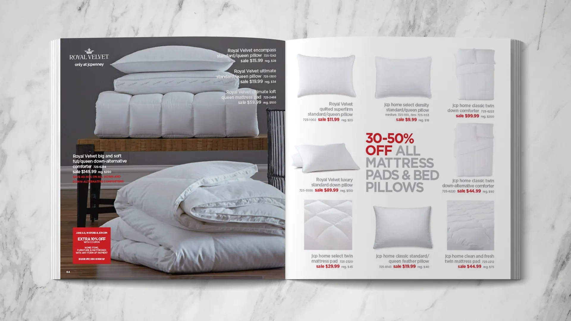
JCPenney’s New Home Store launch project. Internally, we called it the “Big Ass Book”. This represented a comprehensive look at the new home brands as well as the incumbent offerings. At just under 200 pages, it required 6 art directors to design and shoot. I took the lead on the window section (a 3rd of the book) and pitched in designing some of the institutional and furniture pages.
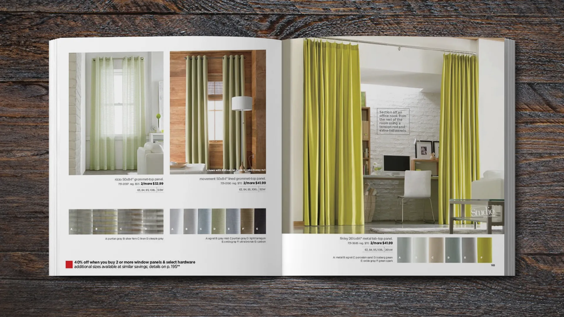
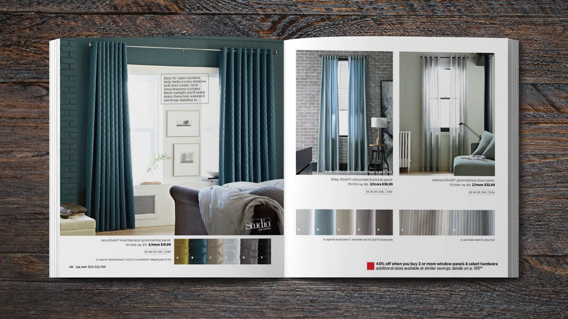
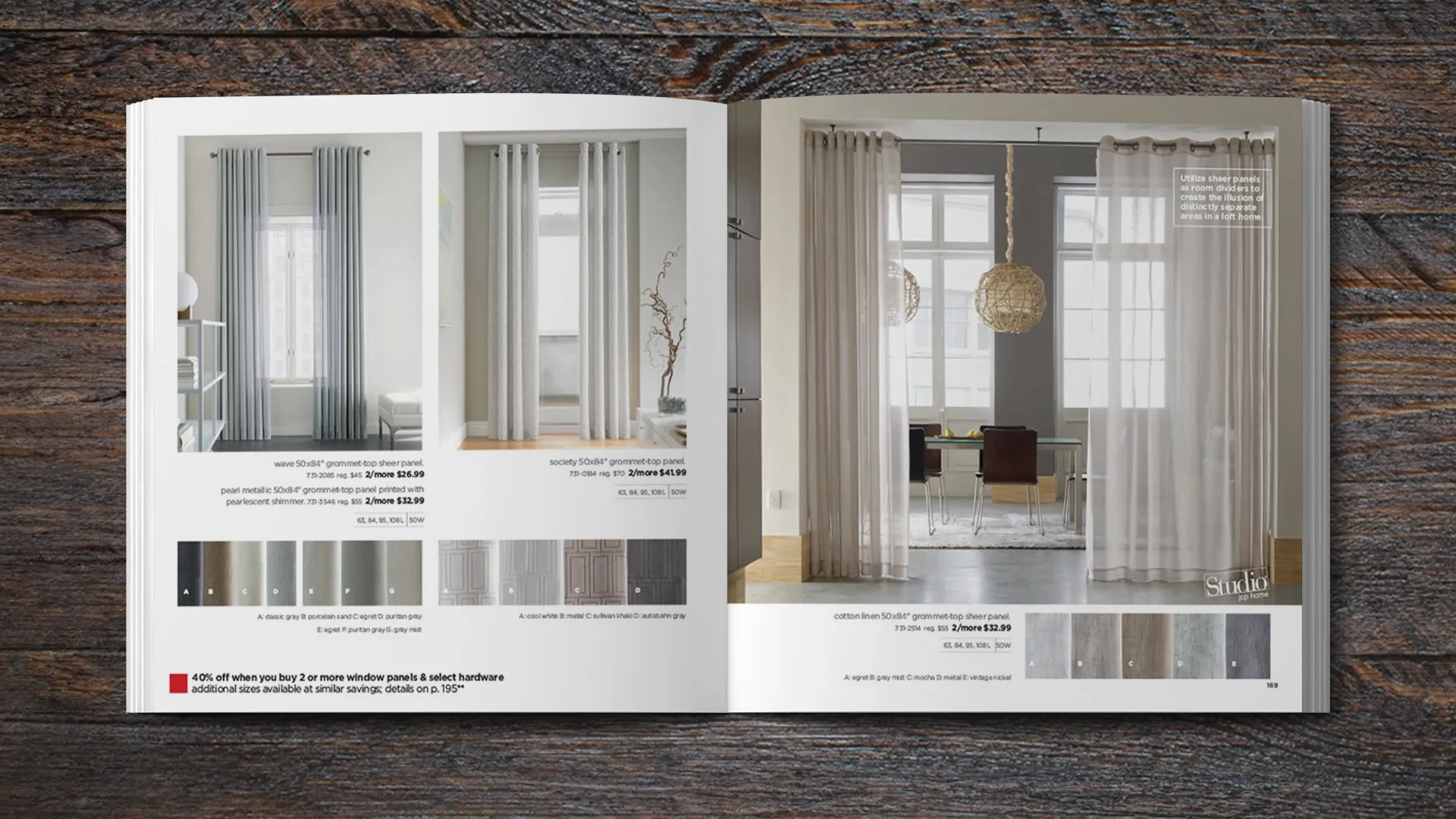
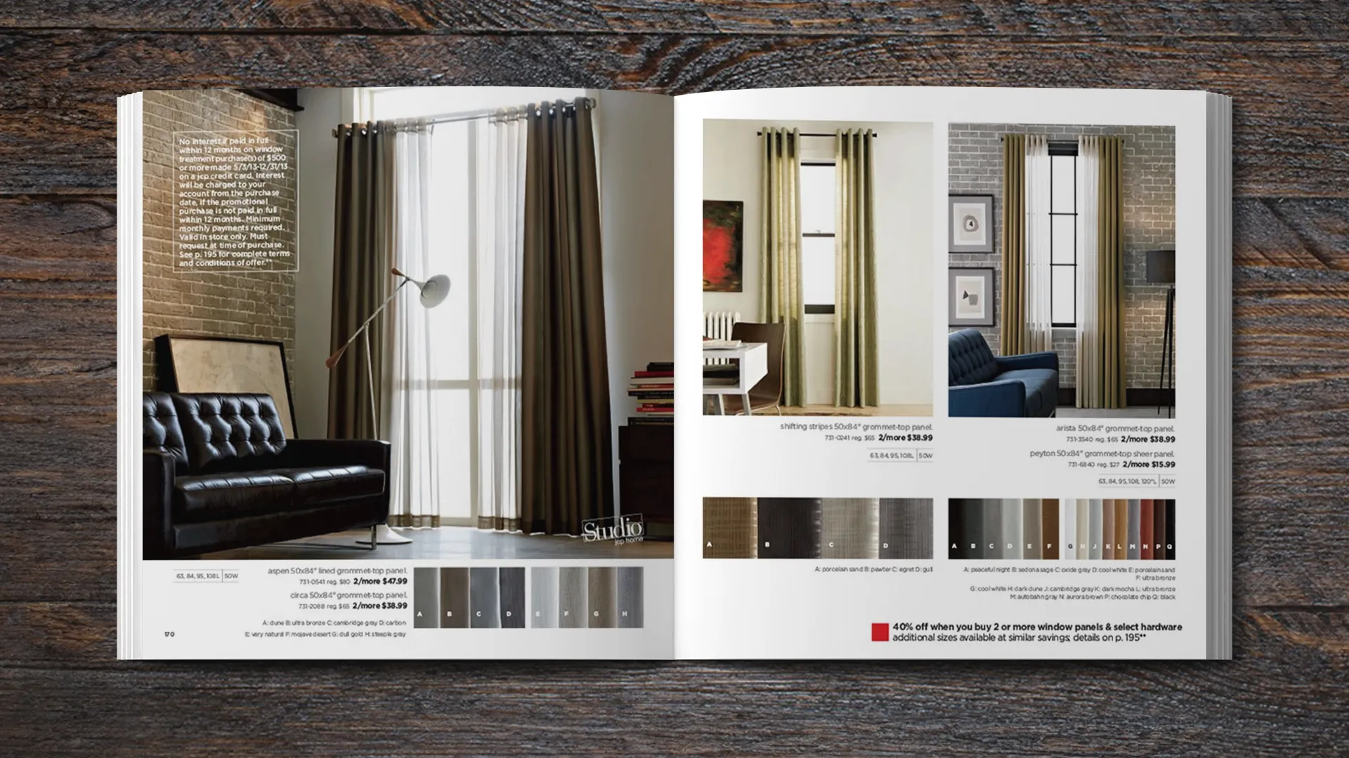
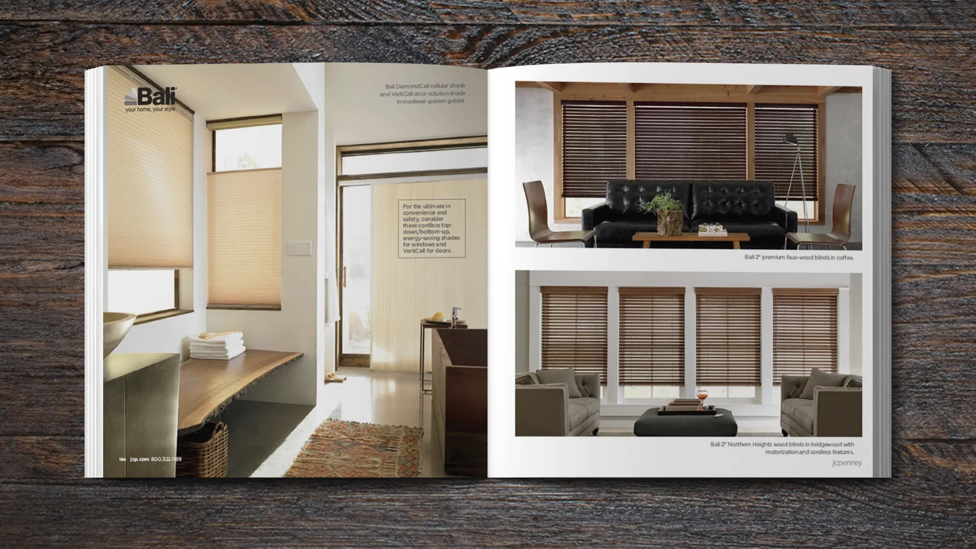
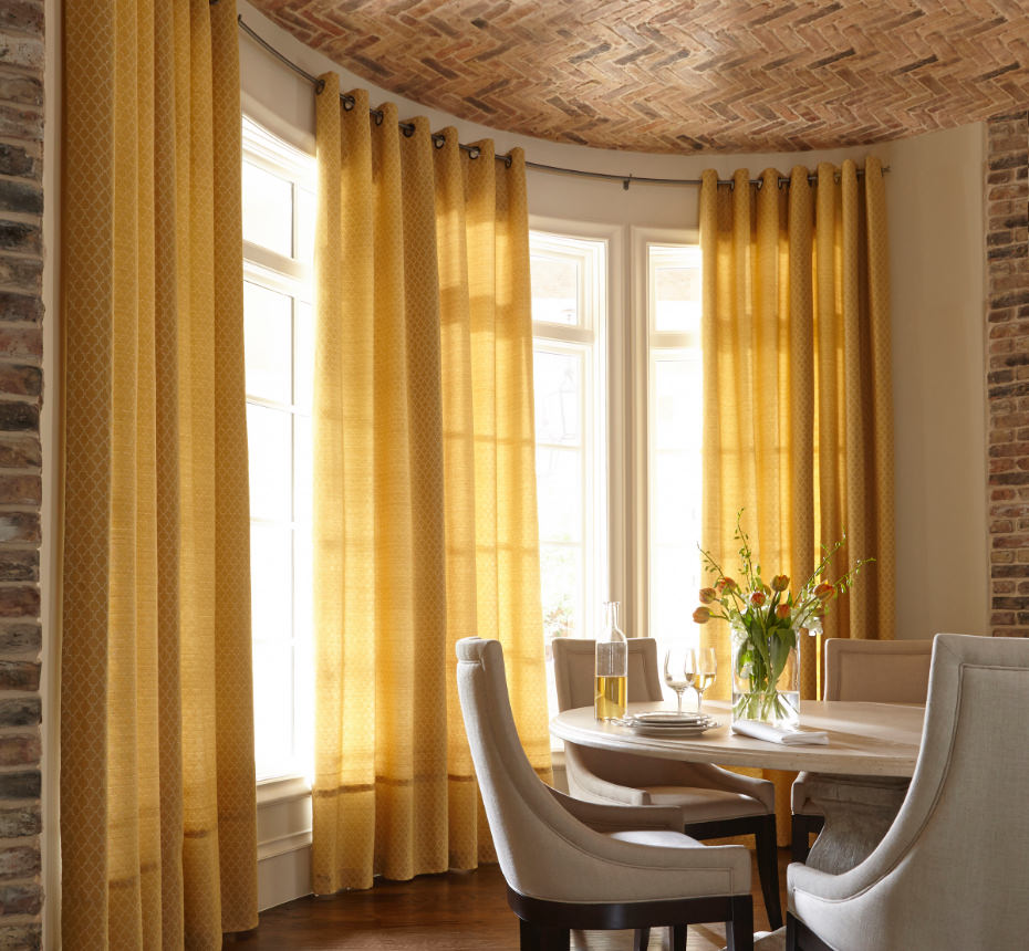
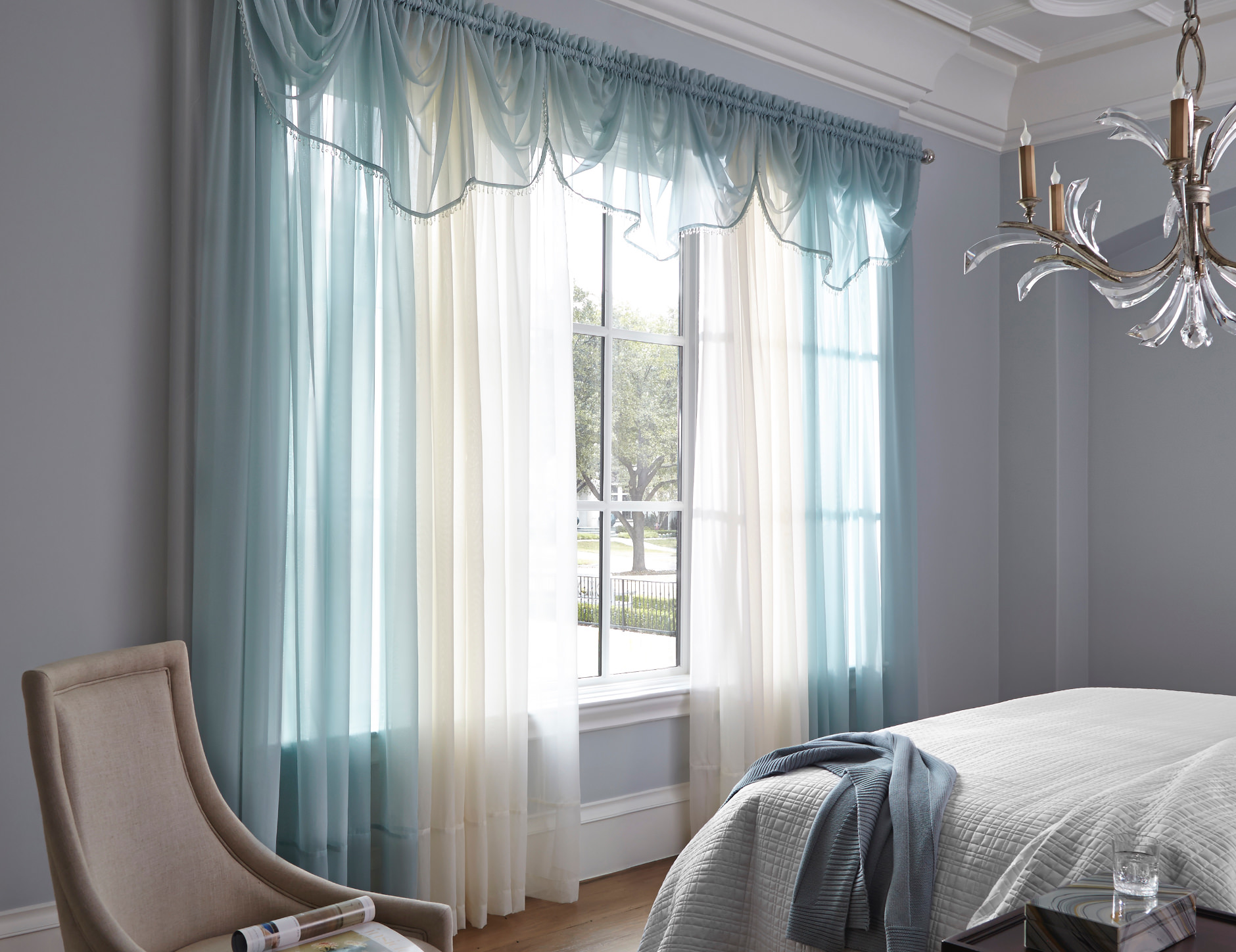
The previous relaunch of JCPenney’s Window Treatment offerings was very successful. Those results were the reason this 200-page catalog was green-lit, since 40% of the book would be a continuation of that project. That allowed me to refine and improve some of the technical features. The size chart treatment was simplified to take up less real estate but offer the same information . To show more of the textile in the color options, the color swatches were shot with a slight roll to showcase the texture. Each program was divided to show modern, neo classic and traditional settings.
Alternative uses for window treatments we worked those into our feature shots. The window hardware was shot with just the decorative finials, sans rods, to romance them up a bit. Lastly, the entire section opens with a dramatic four page gatefold featuring the measuring guide inside.
Branding, Photo Direction, Print Design
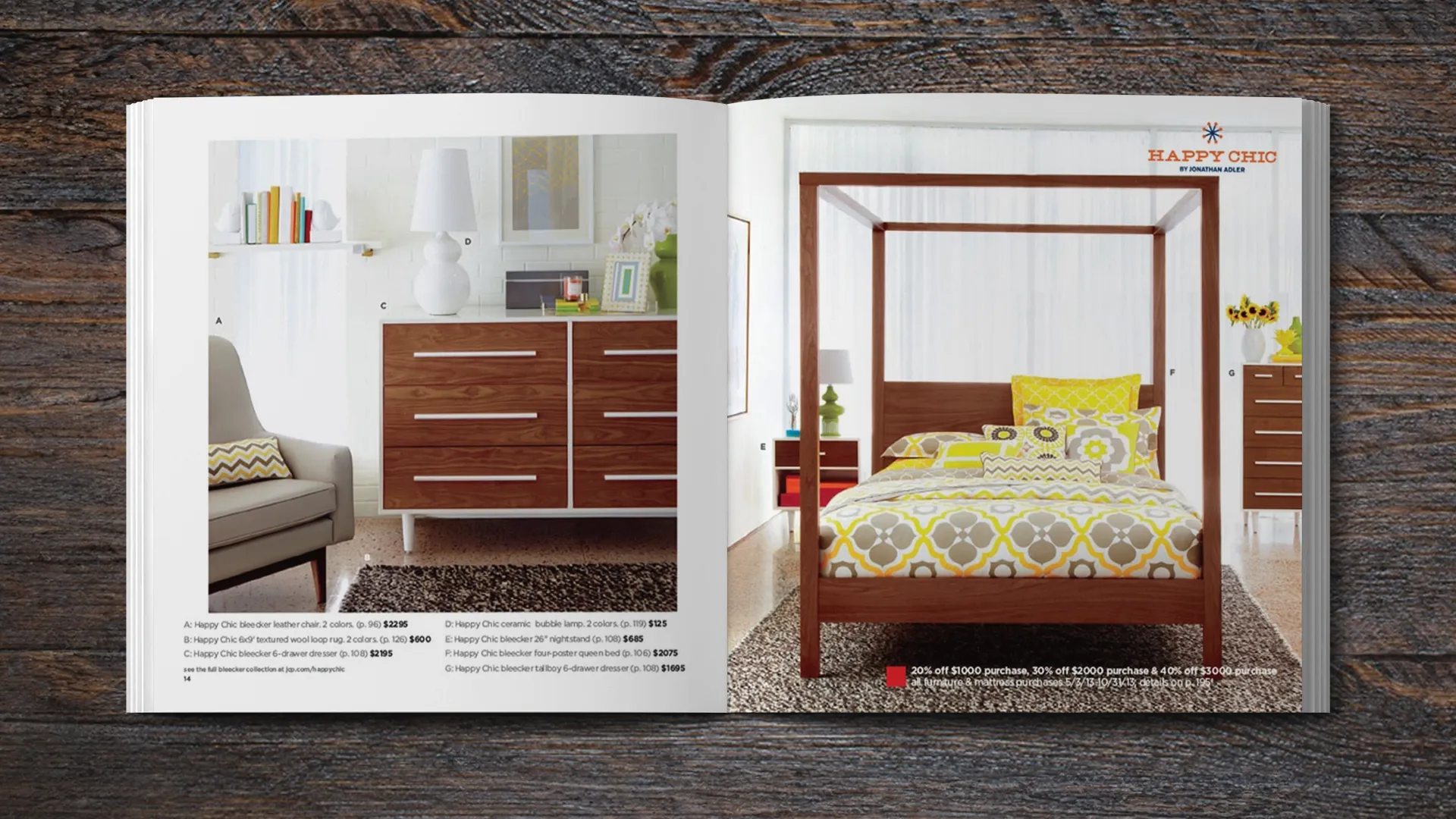
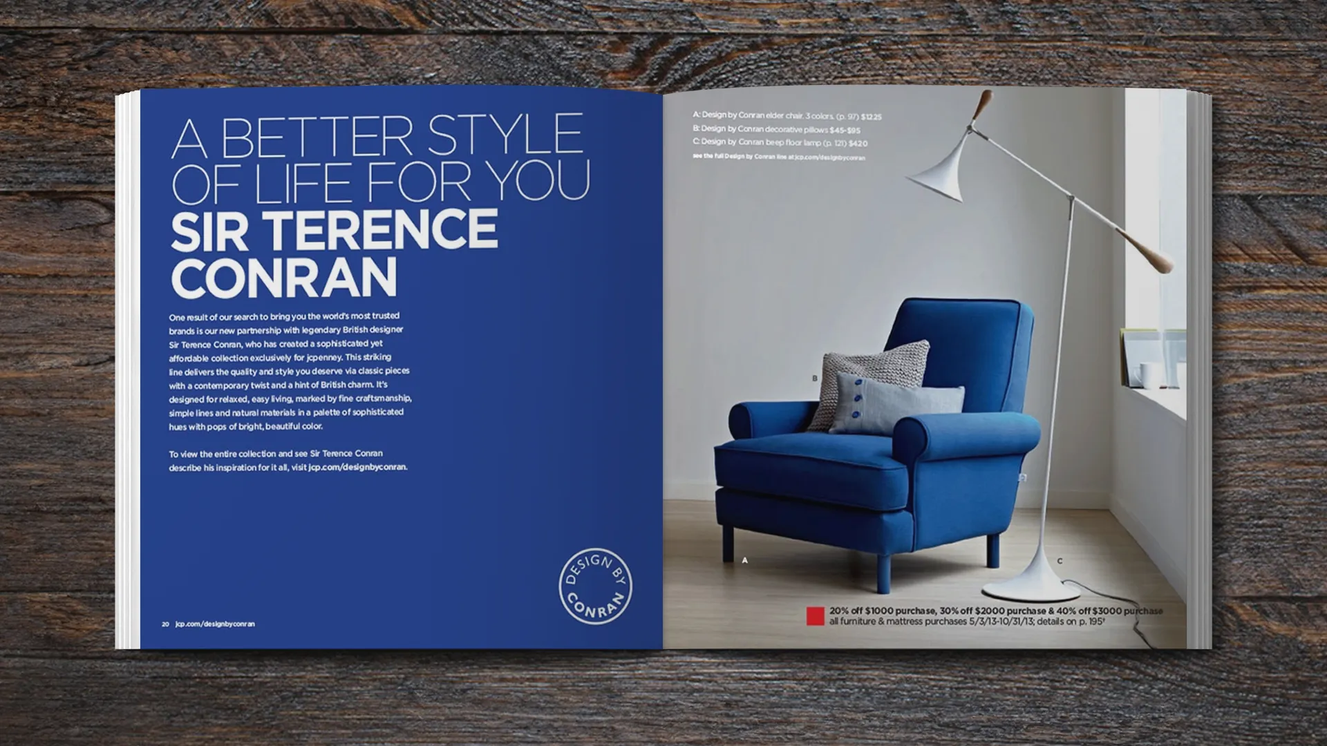
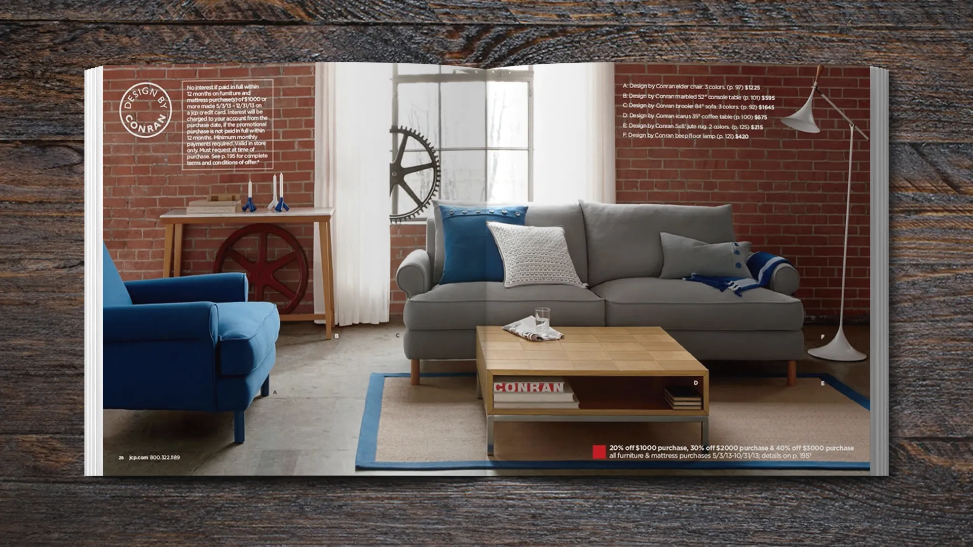
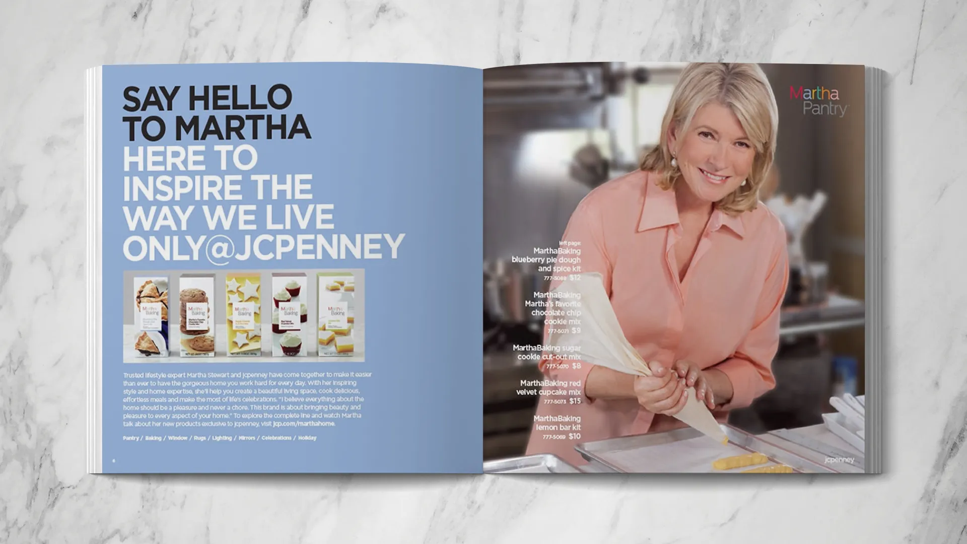
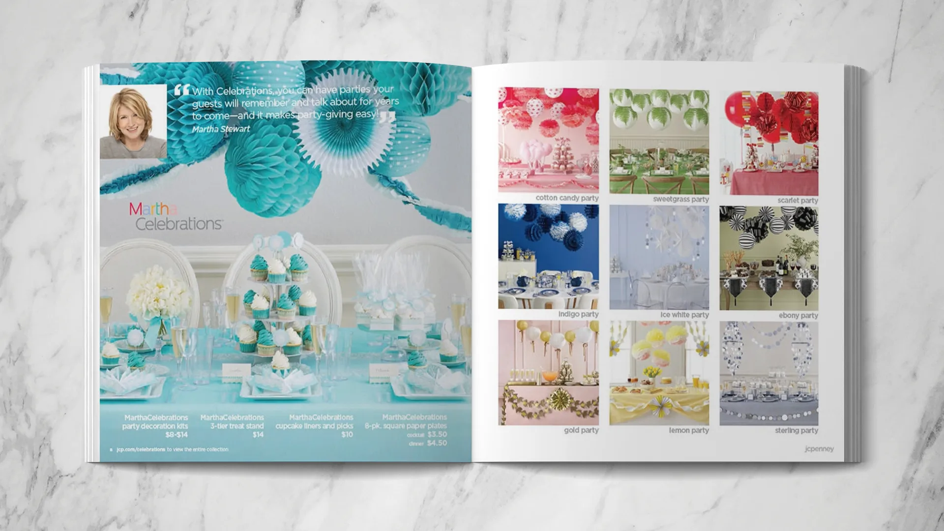
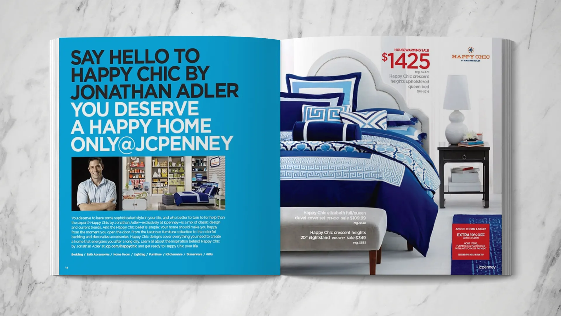
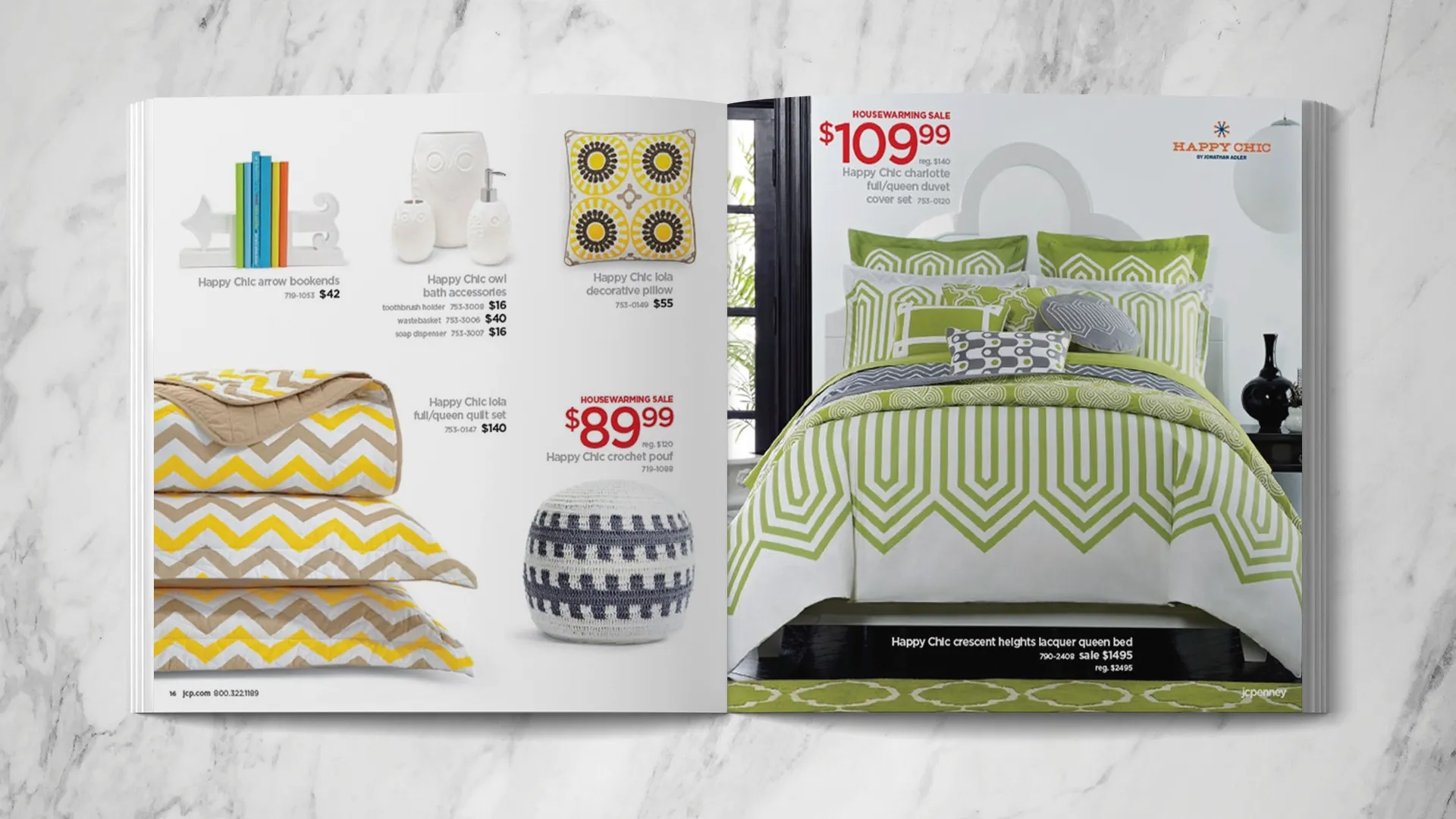
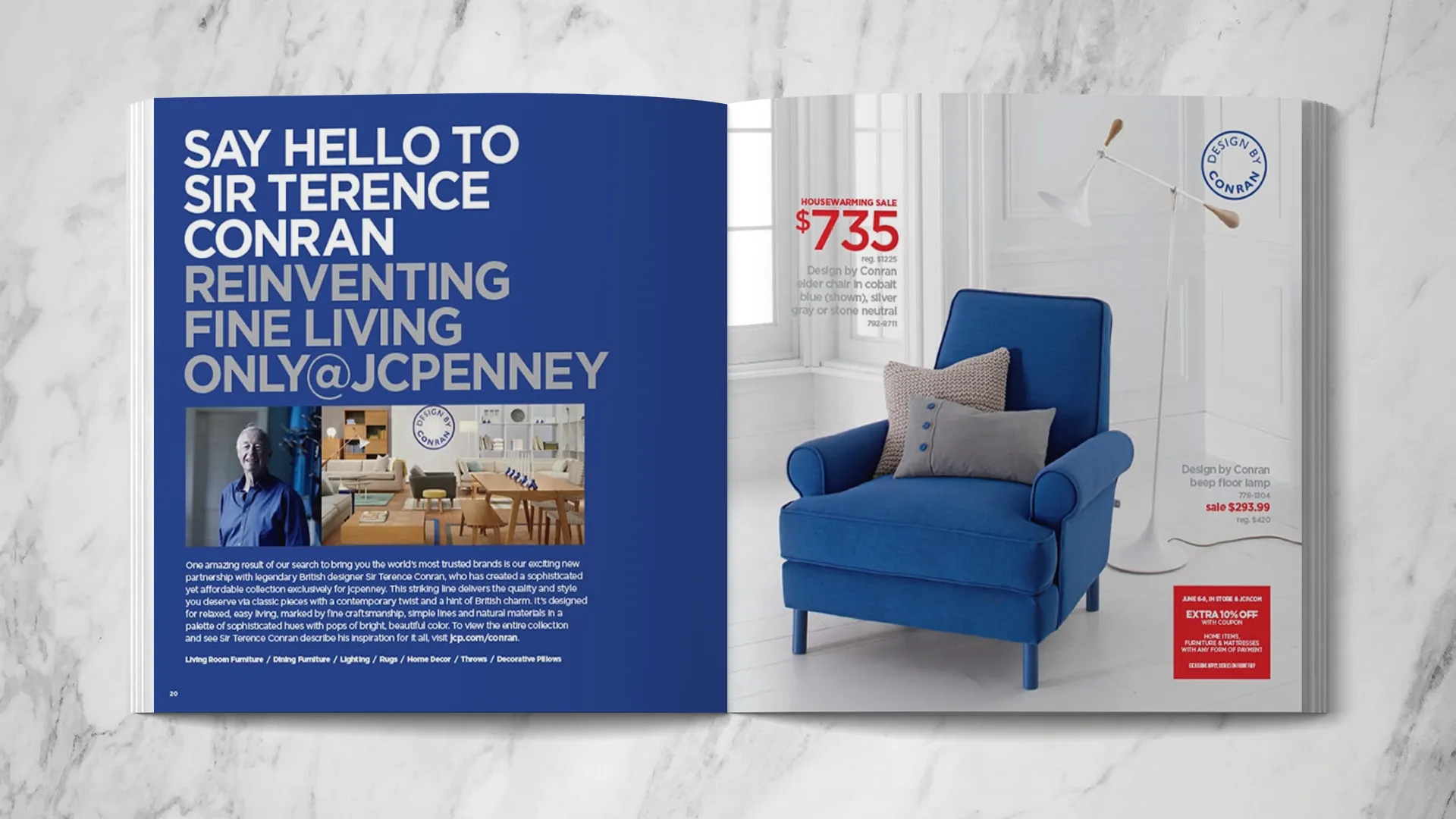
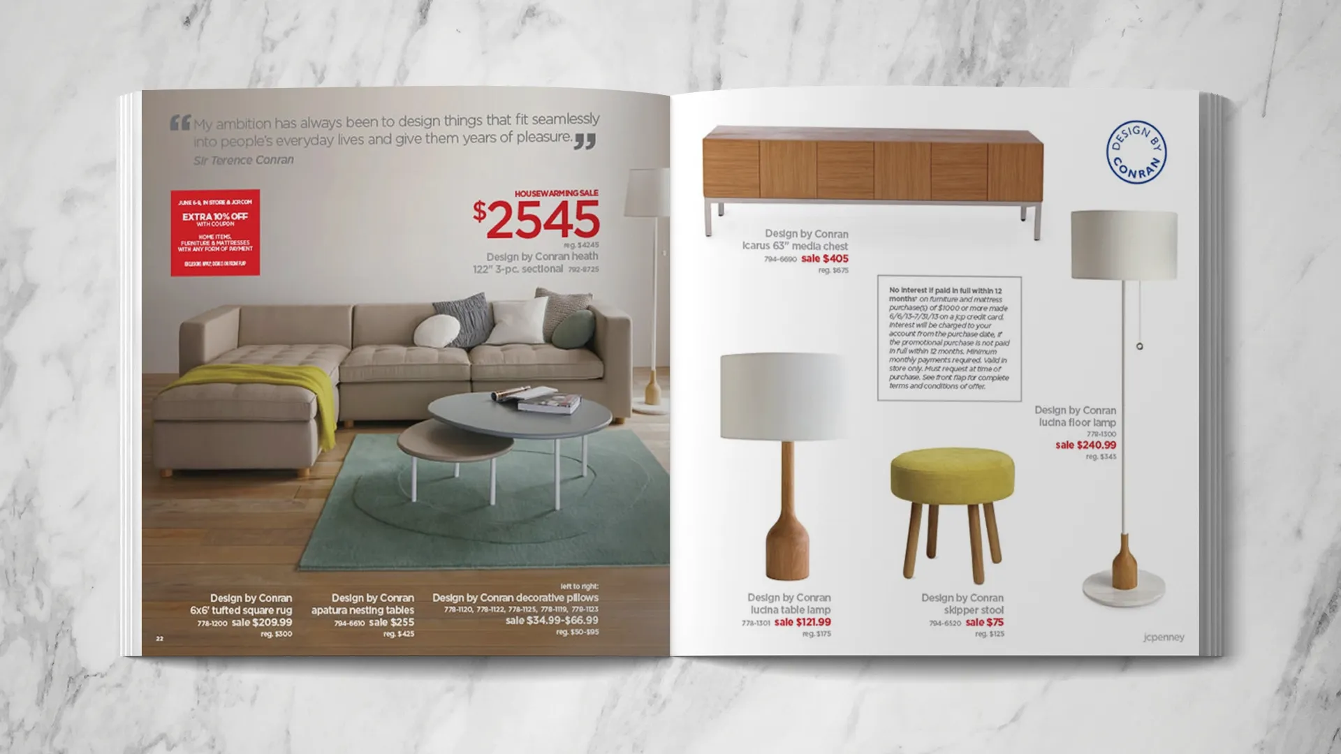
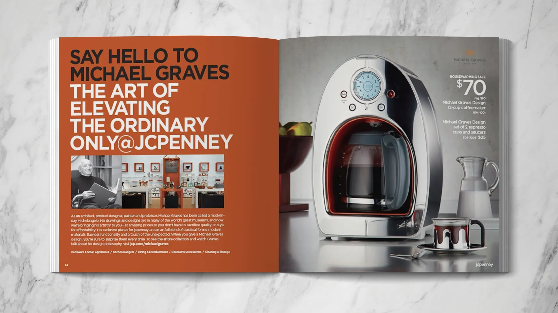
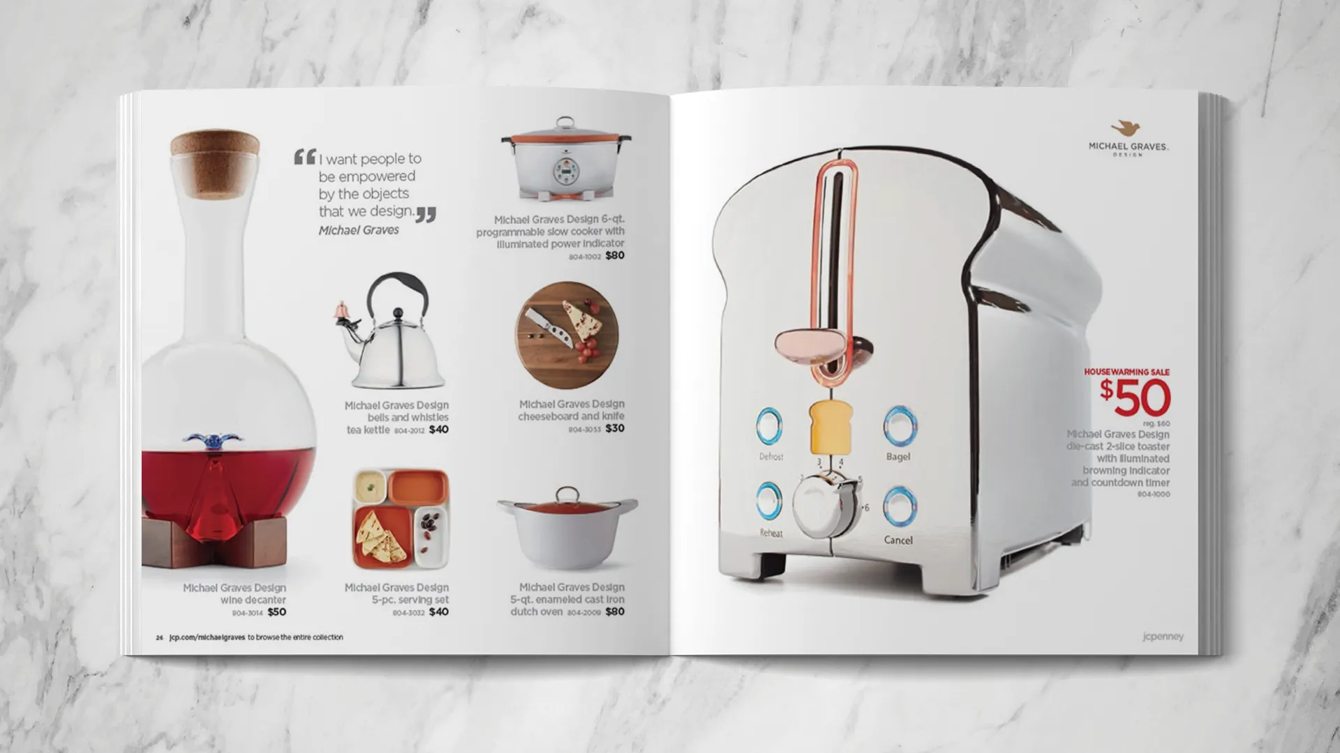
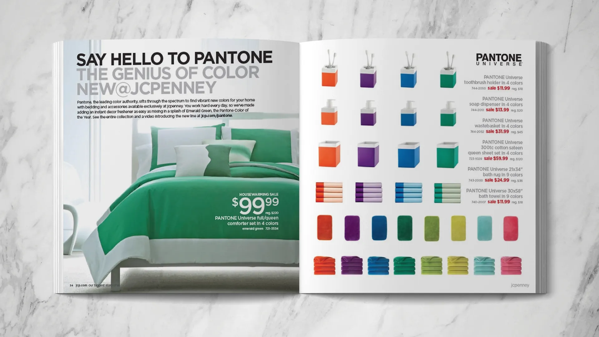
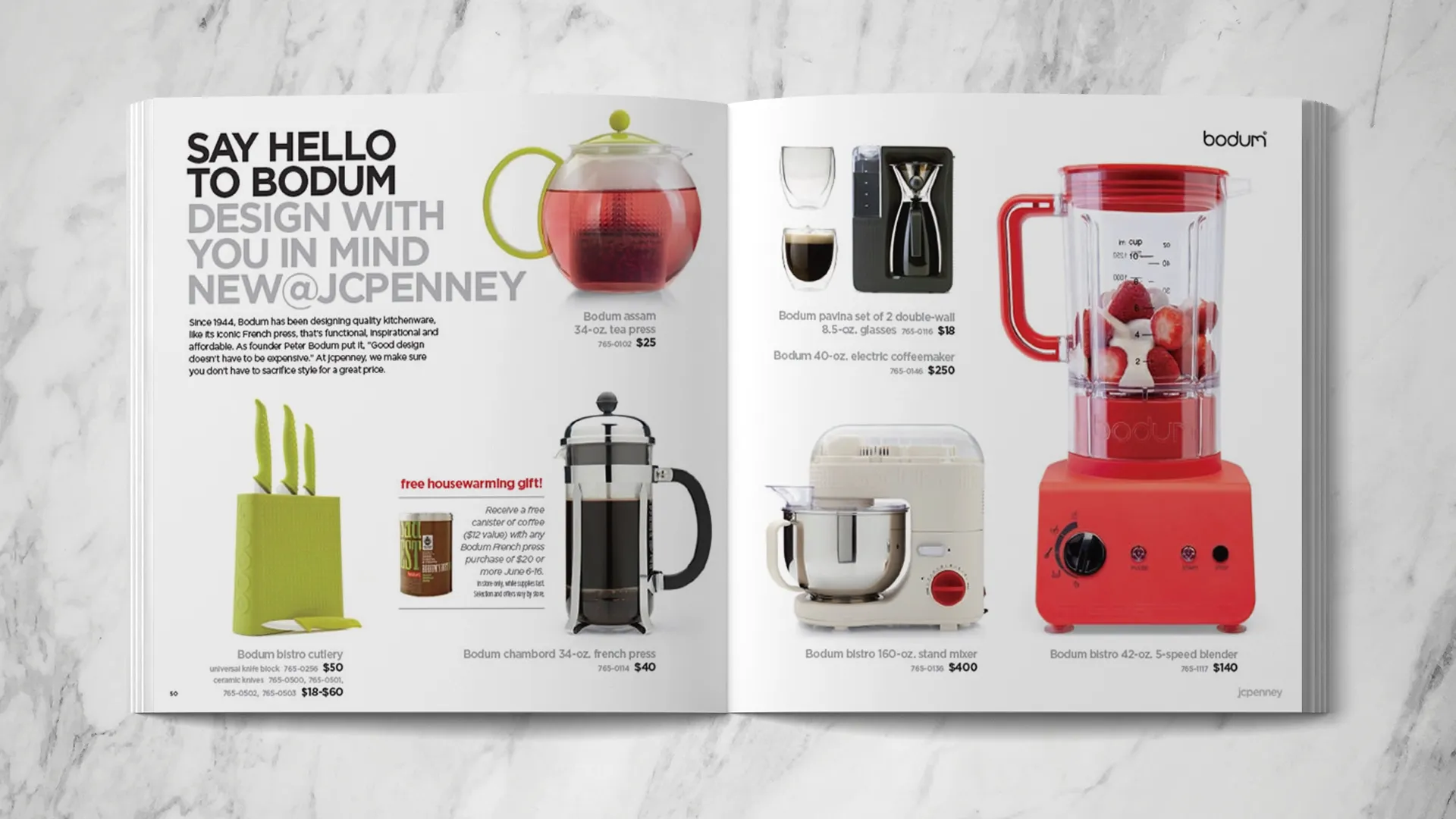
Martha Stewart, Johnathan Adler, Sir Terence Conran, Michael Graves, Pantone, Bodum, and JCP Everyday. This constituted the most aggressive overhaul of the JCPenney home store in company history. This project focused on introducing the new brands being launched.