Creative Direction, Branding, Photo Direction, Print Design
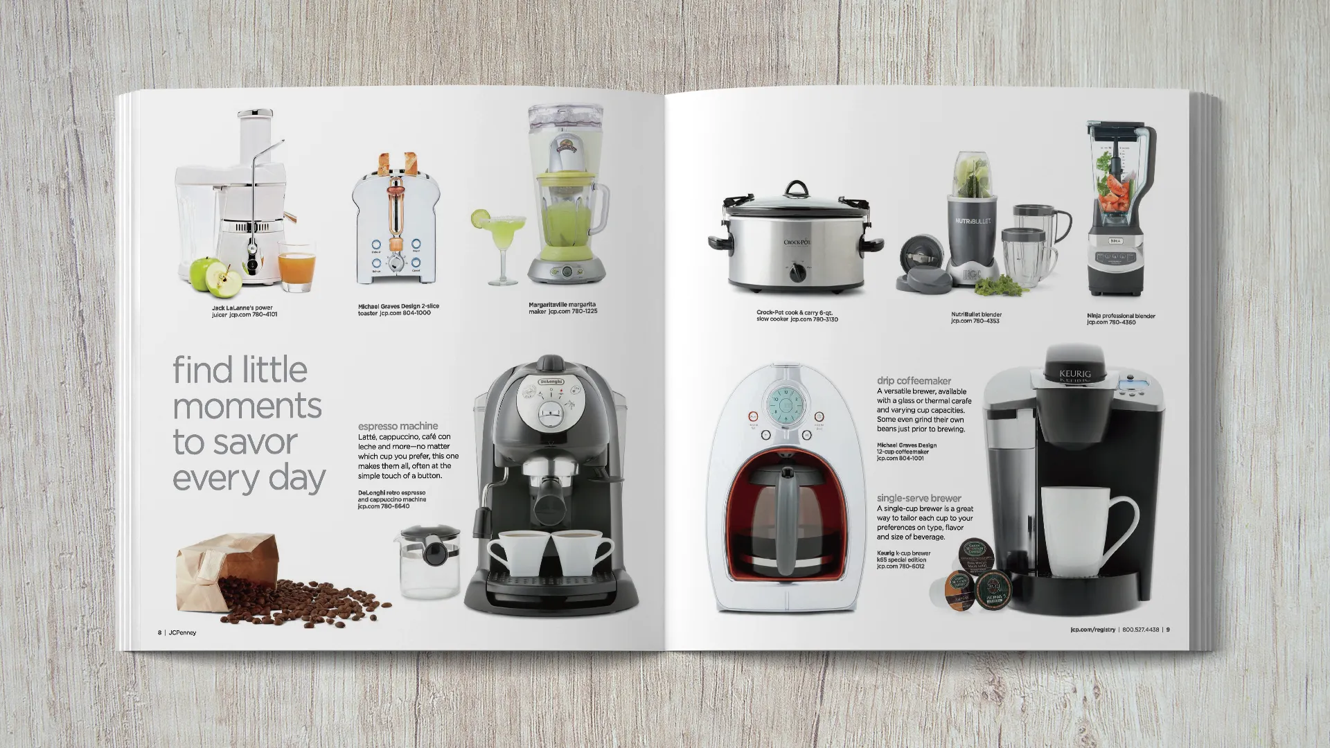
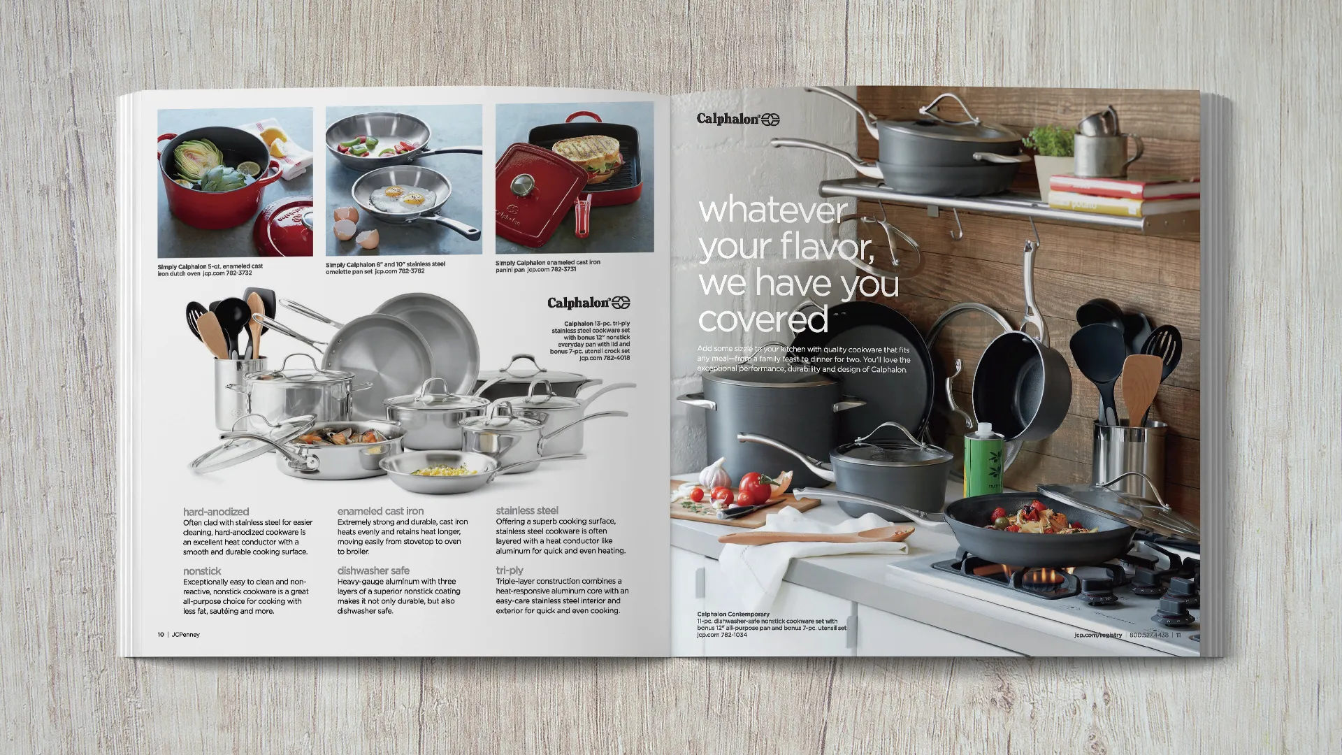
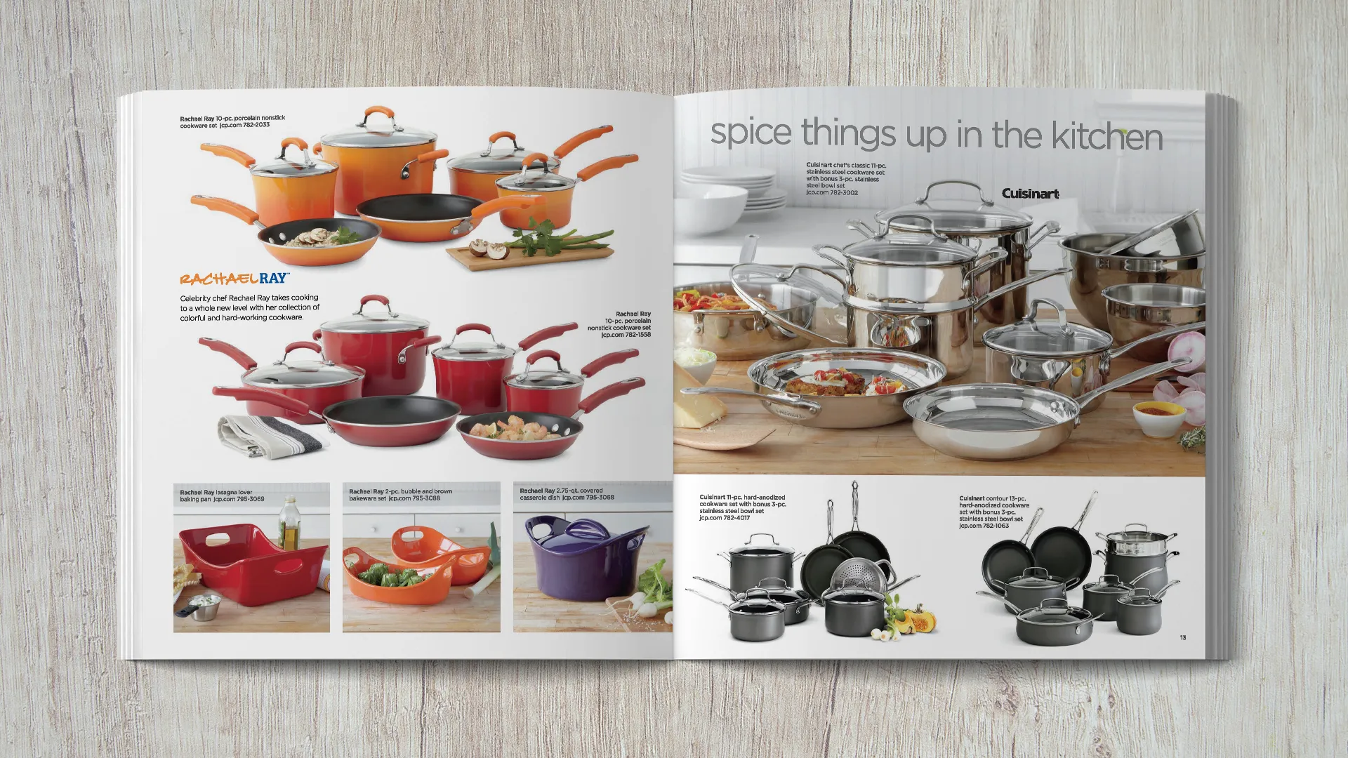
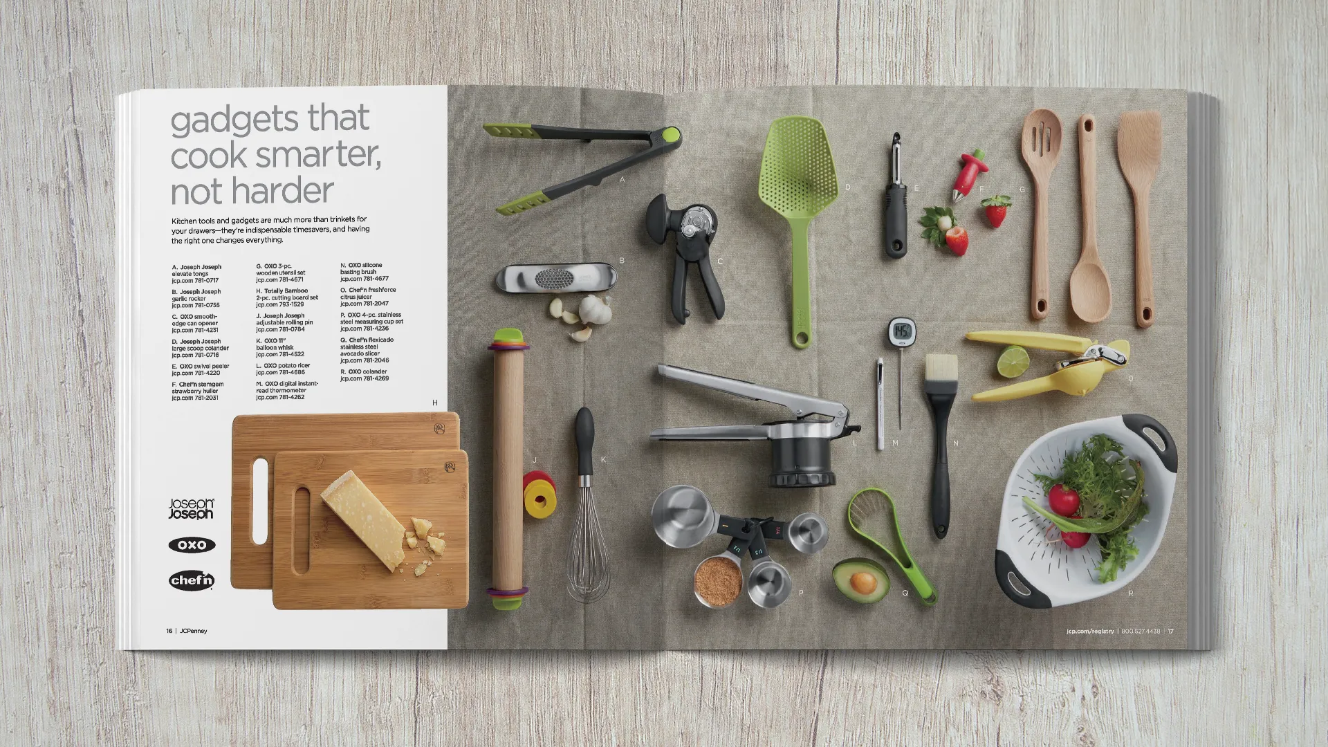
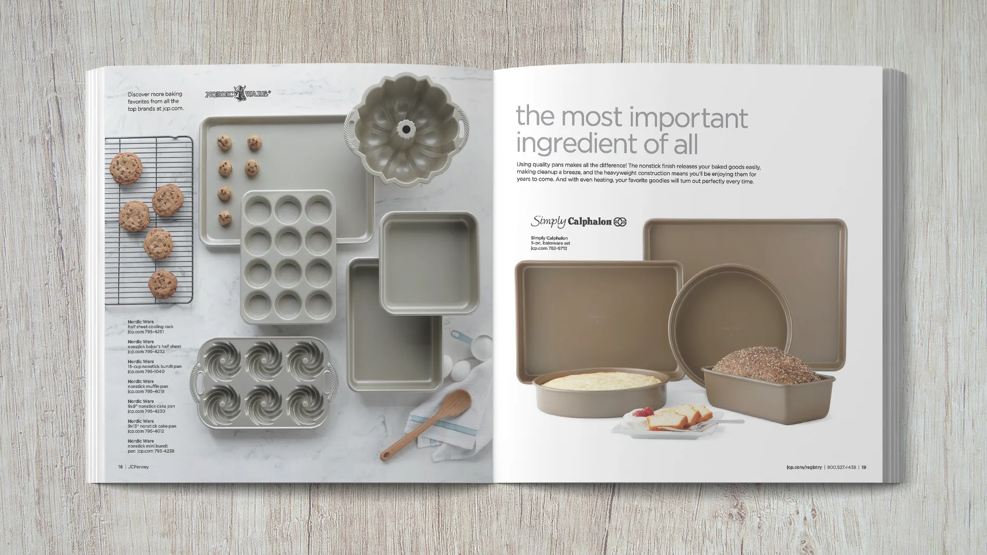
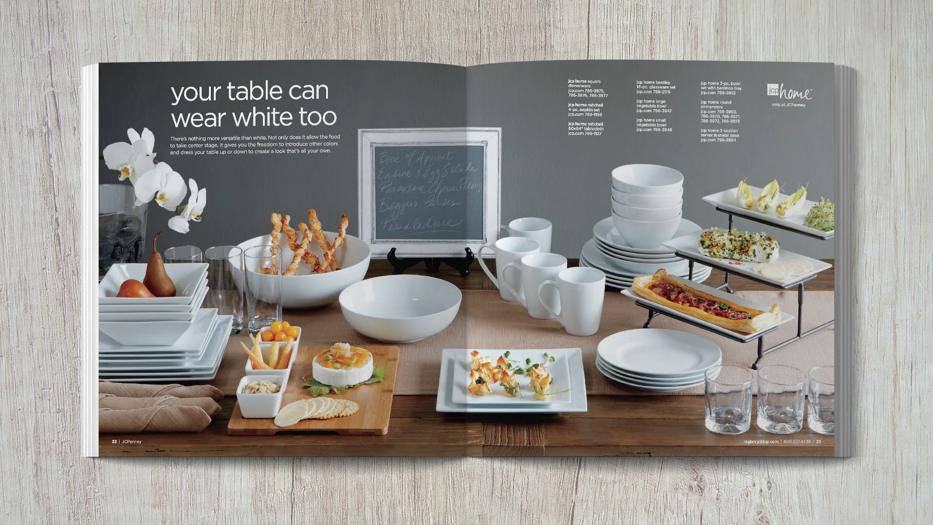
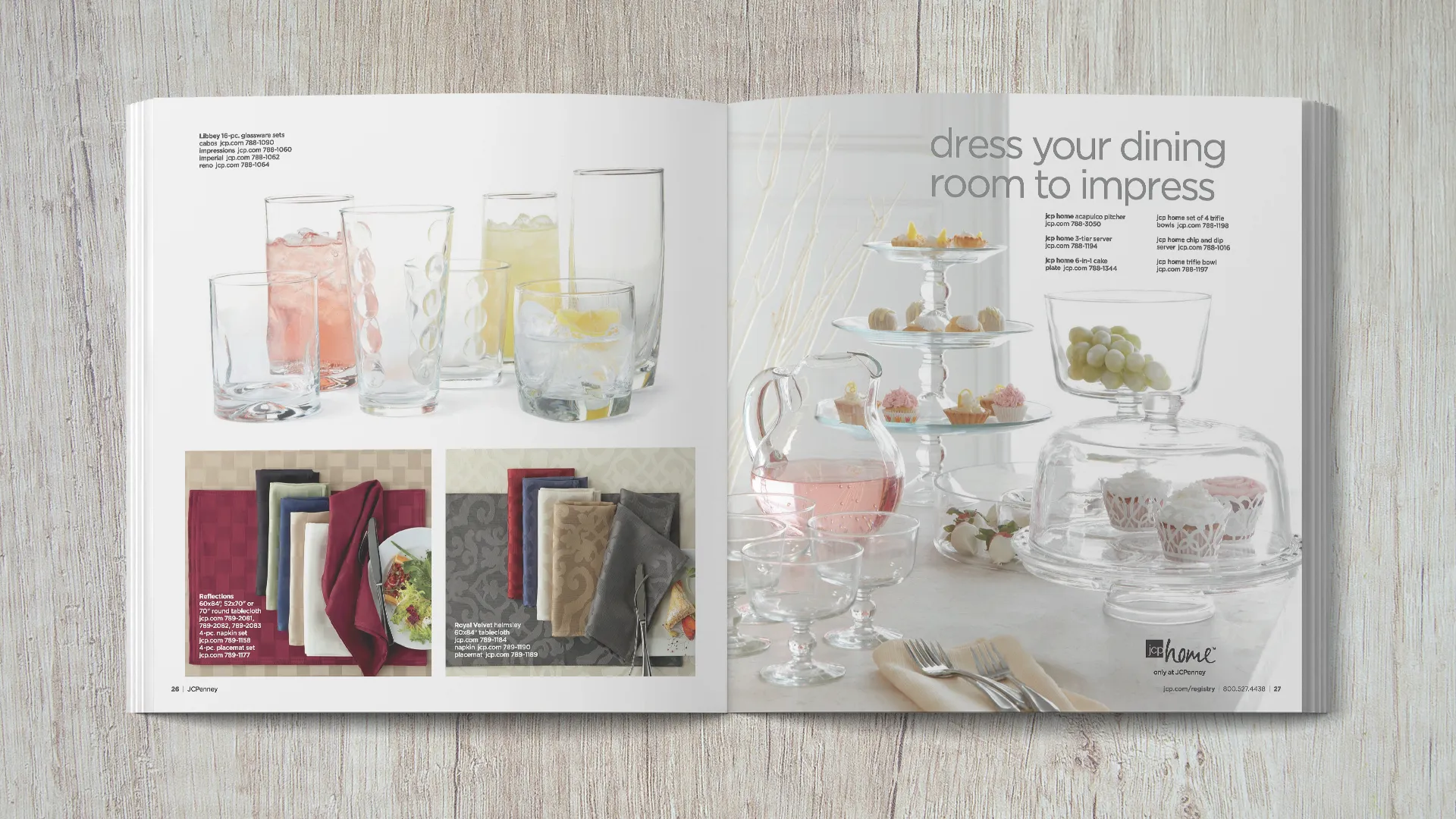
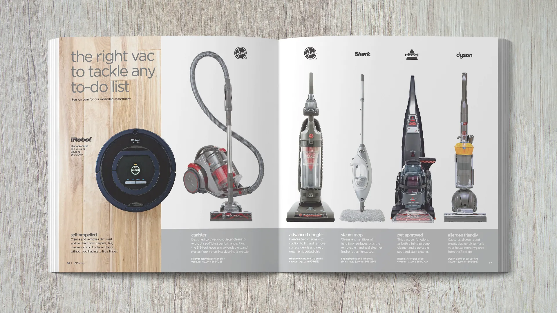
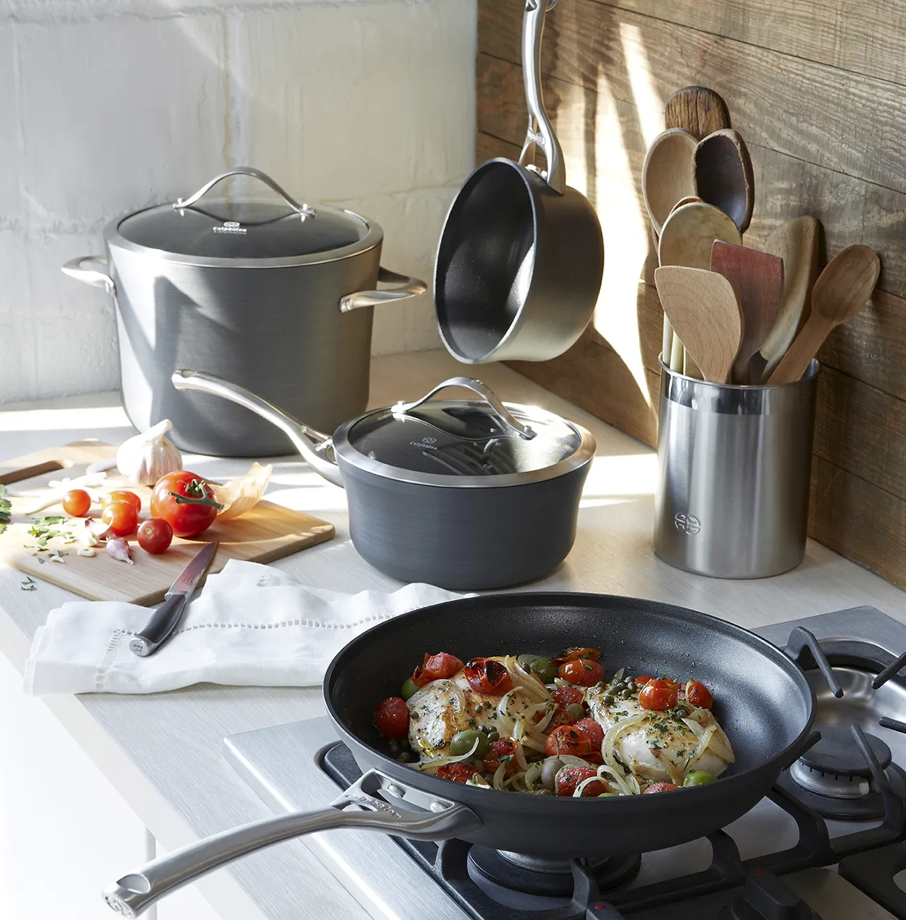
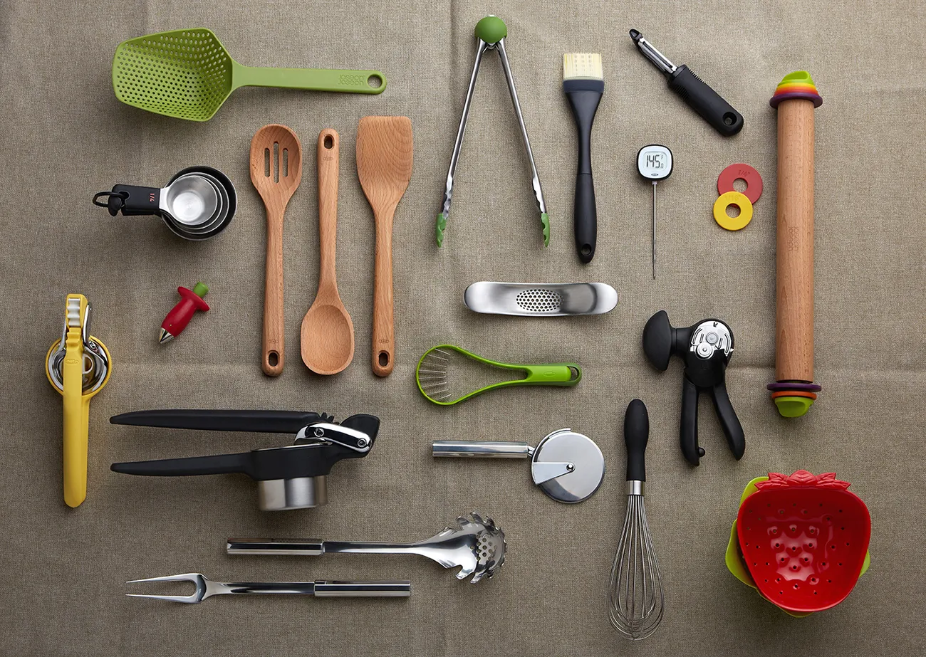
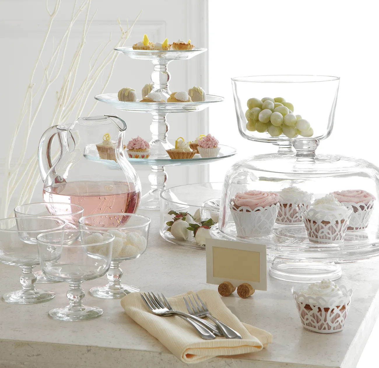
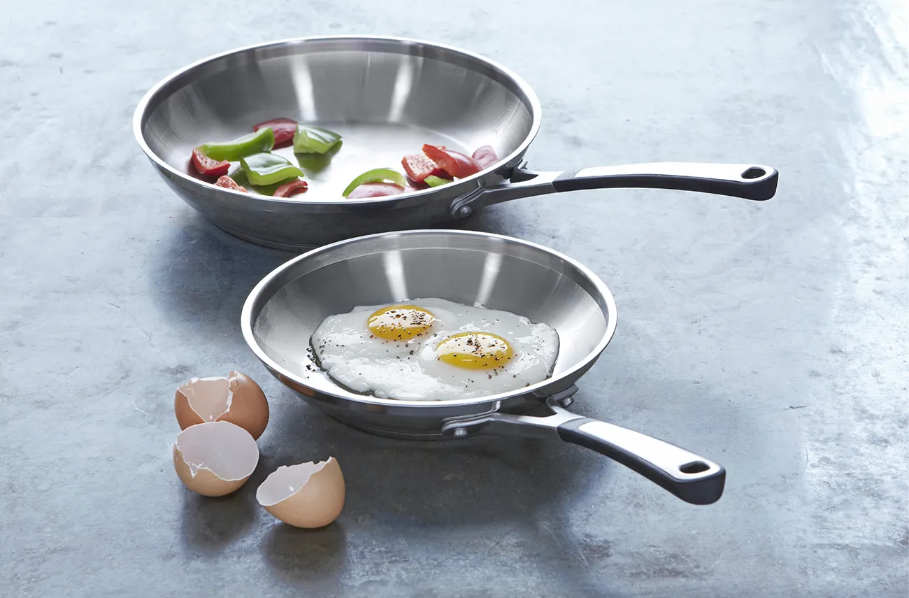
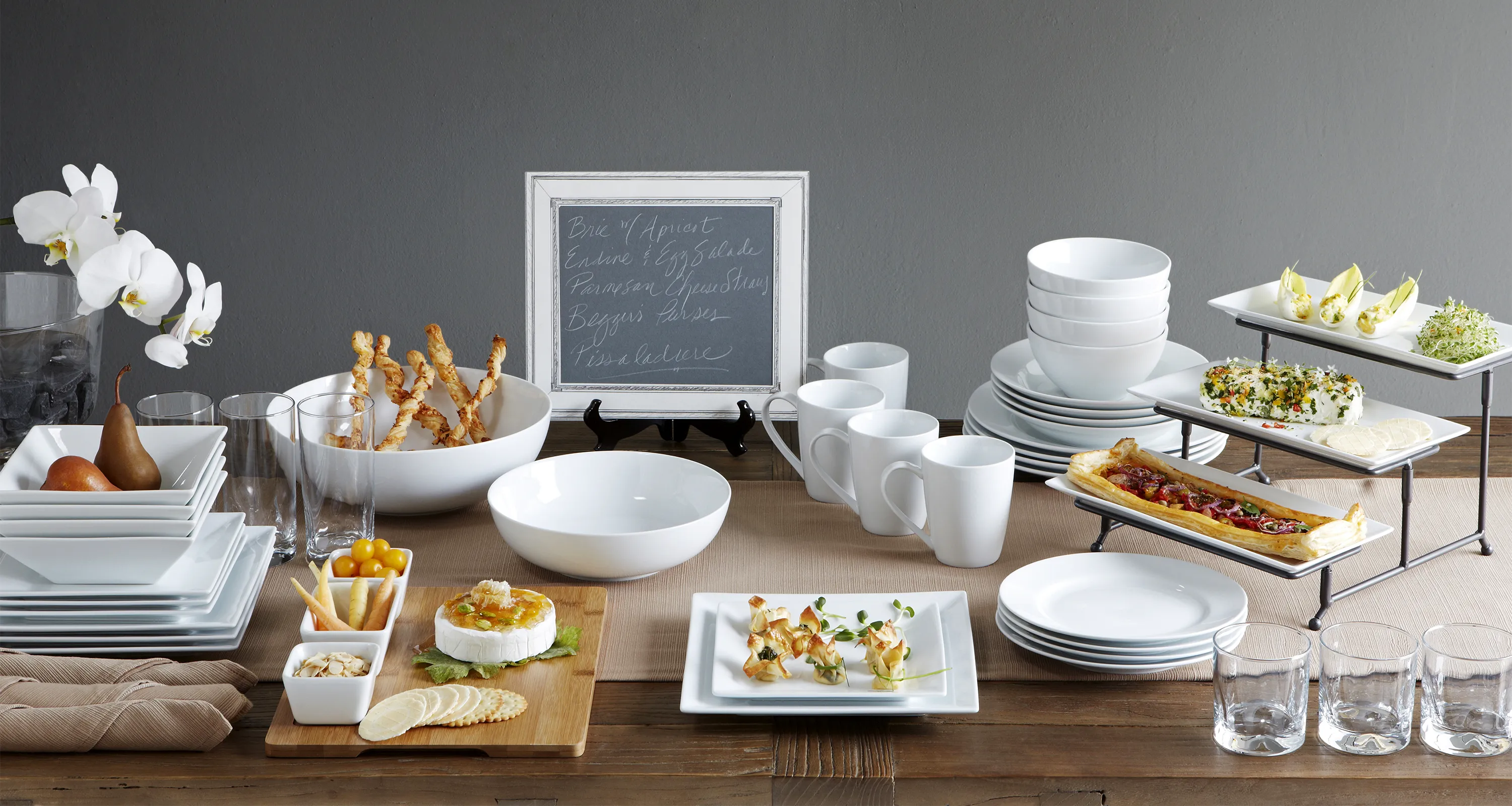
A showcase for JCPenney Home, we used this as an opportunity to step up the editorial quality of the photography. Textural surfaces, natural light and food propping were incorporated throughout. The product density hit a sweet spot of being rich without becoming institutional. Allowing the layouts to have a magazine quality. This project was held as an internal benchmark for photography execution for the home division and exceeded sales goals.

