Creative Direction, Branding, Photo Direction, Print Design, Infographics
JCPenney’s window division is one of the largest in the industry and the largest revenue generator for the company that isn’t apparel. The company identified the need for an overhaul of how the product was presented to maintain that market share. Embracing friendly competition, a group of 20 art directors and copywriters were tasked with conceiving a new contemporary presentation for the entire division. My approach, which emerged as the winner, aimed to emulate the sophistication of an architectural digest.
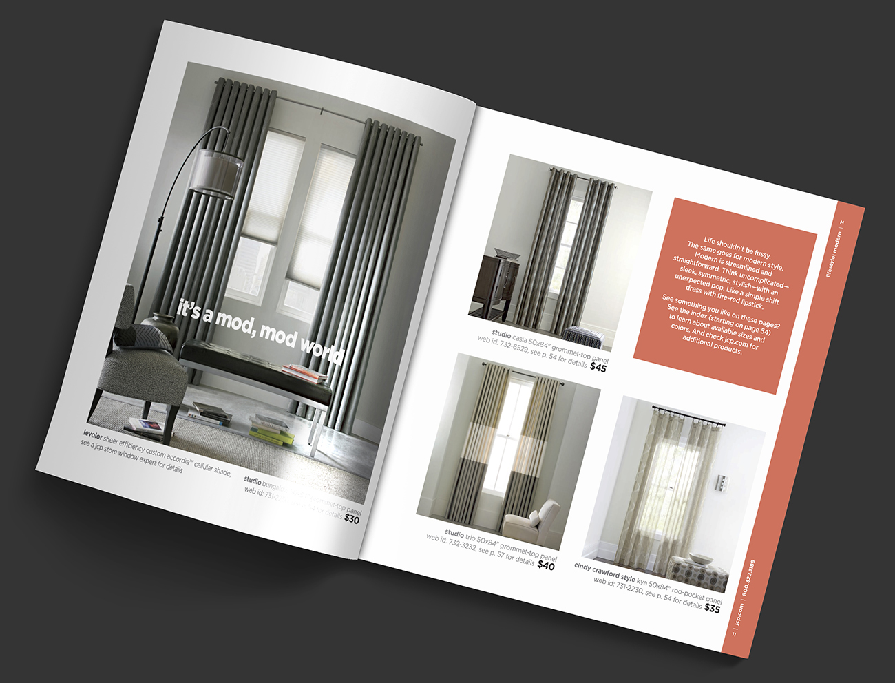
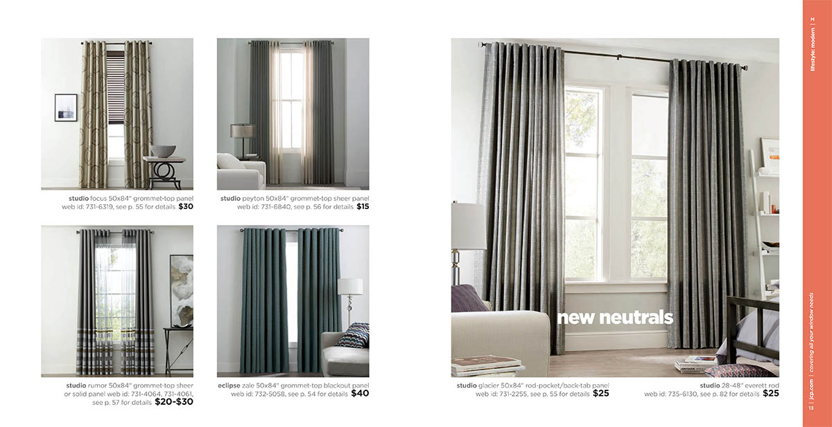
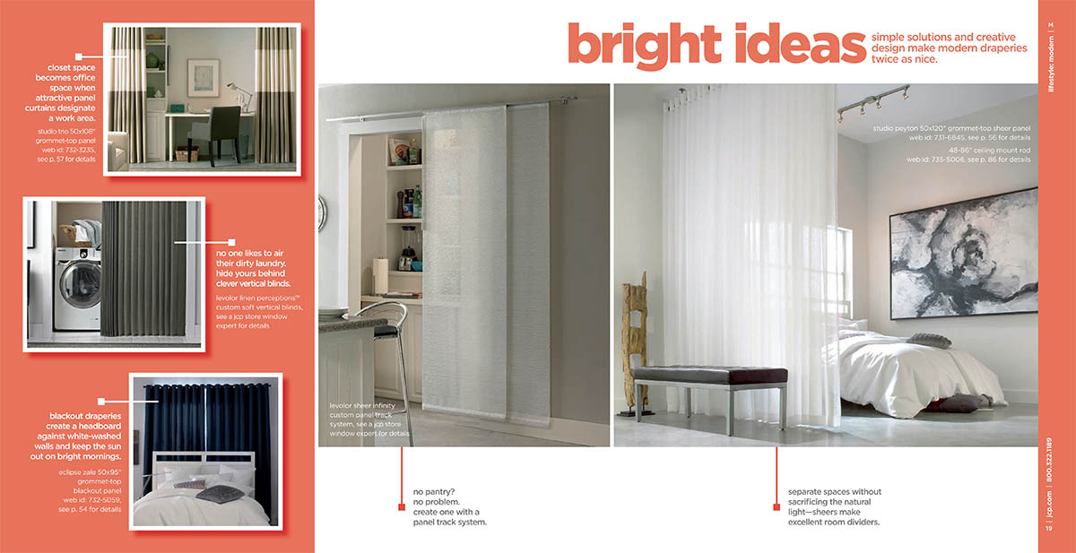
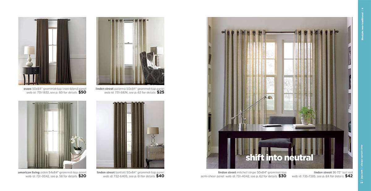
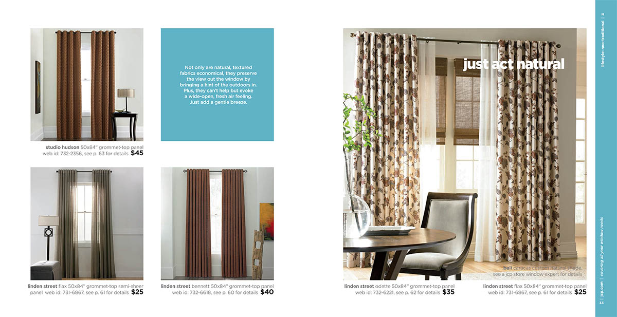
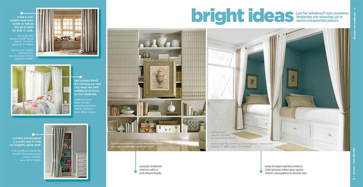
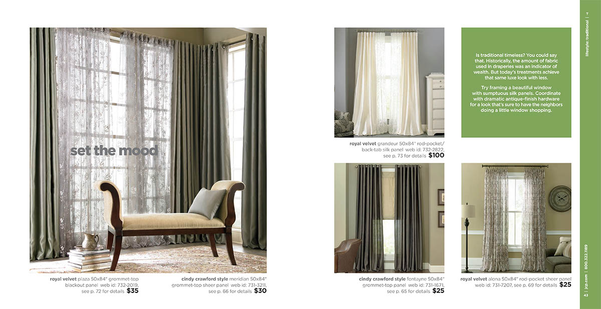
Considering the technical information accompanying each product, the book was thoughtfully divided into two parts. The first half emphasizes style, with products grouped into Modern, Neo Traditional, and Traditional sections. The layout features ample white space, elevating the overall look. Transitioning between each section, break spreads showcase inspiring ideas for non-traditional product uses.
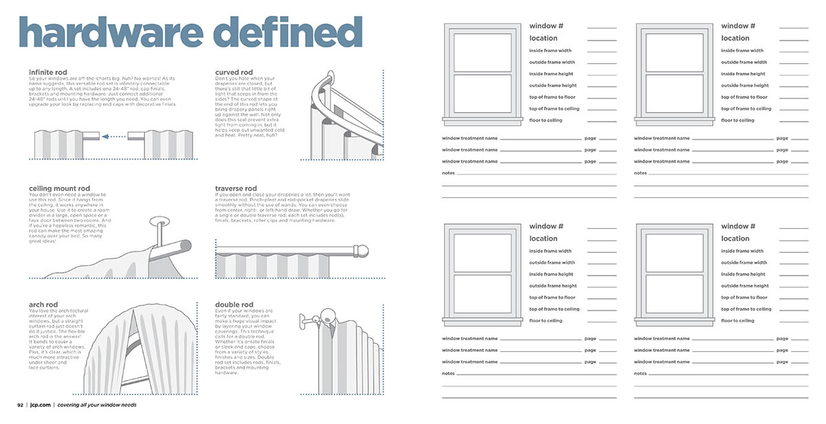
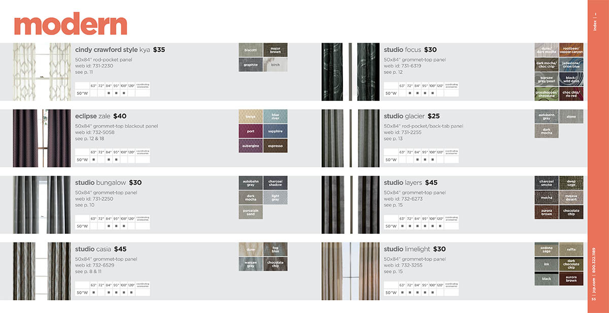
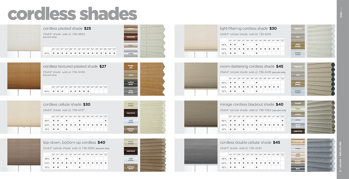
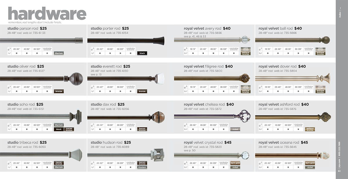
The second half of the book is more focused on technical information. Every option in JCPenney’s catalog of drapes, sheers, blinds, shades and hardware are represented. This includes all color options, finishes and sizing available.
For me, this was the most rewarding part of the project. Arranging all of the options in an easy to decipher framework is a design challenge. The layouts in this section are consistent and easy to read while organizing all of the material.
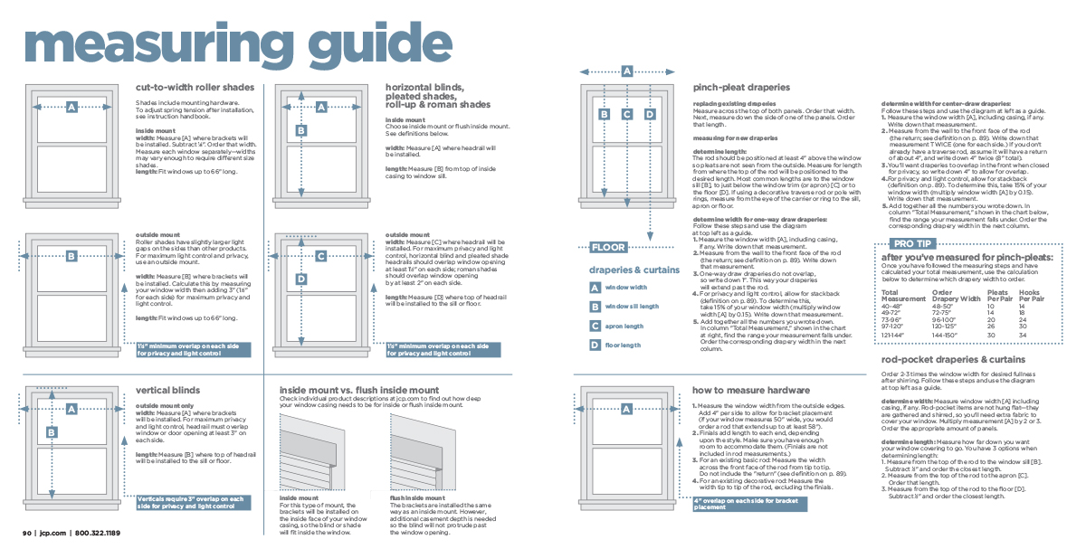
The book ends with the measuring guide. This was designed from the ground up, as JCPenney had no formal guide to this point. Sections of this guide were taken from multiple sources, refined and revised to create one cohesive manual.
This had a lasting influence in the company’s window program, as it was eventually rolled out to multiple projects and store signage. It also set standards for infographics that continue to be expanded and in use to this day.
