
(01) About
Client
Keen AGI
Creative Direction • Branding • Identity • UX
A different path to intelligence.
Keen Technologies is pursuing AGI through embodied reinforcement learning—systems that learn through real-world interaction and the consequences that come with it. Led by John Carmack, Keen approaches one of technology’s hardest problems with a clear point of view: stay small, think carefully, and avoid fashionable shortcuts.
(02) Identity
A logo with its own logic.
Keen needed an identity that could feel technical without feeling generic. Precise without becoming cold. Modern enough for AI, with enough retro-tech character to reflect a hands-on approach to building.
A custom wordmark became the foundation. Based on Outfit, the letterforms were refined to balance sharp angles and smooth curves. The terminals of the “K” form an arrow-like configuration, while an angled bracket references the language of programming. A stylized cursor completes the mark.
(03) Palette
Retro-tech, refined.
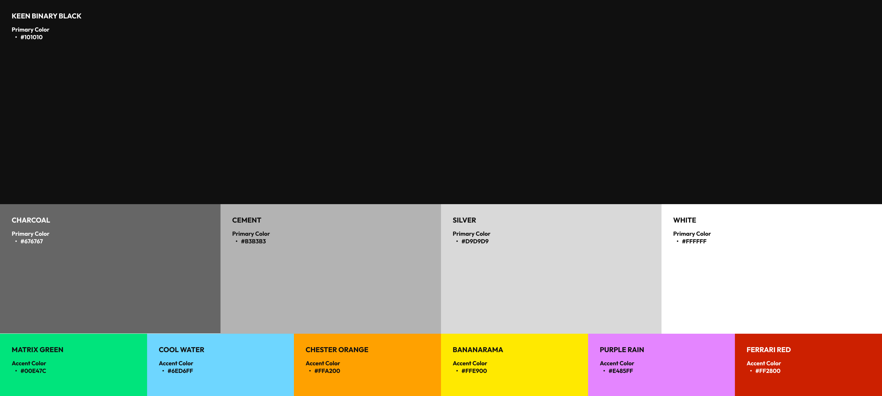
The visual language draws from the optimistic utility of early computing, game design, and aerospace systems. Binary Black (#101010 easter egg) anchors the palette with a range of neutral graphic tones creating the structure for a mostly monochrome world. Bright accent colors add energy when needed, each named with a nod to pop culture and Carmack’s history with a certain car company.
(04) UX
Code as atmosphere.
Most AI companies lead with promises, features, and capabilities. Keen’s work called for a more honest frame: active research, open problems, real constraints, and progress still being made. The website was designed as a place to explore that work—not simply consume a sales pitch. Research initiatives, tools, publications, and project updates are given room to breathe within a system that feels direct, transparent, and developer-minded.
The interface pairs bold typography with monospace details, creating a clear hierarchy between big ideas and technical information. Grids, data-like labels, and terminal-inspired interactions reinforce the research-driven point of view. Color appears as ambient light rather than decoration, while a fractal background pattern adds depth without competing with the content.
A sharp, fast-loading digital home for a company working on intelligence in the real world.